Cart abandonment is a frustrating problem. Here’s how you can reduce it.

As an online store, whether just starting out or not, you likely put a lot of effort into increasing sales.
You create a product, or products, that people want. You design a nice looking website to showcase these products. You send out promotions to encourage sales and invest in email marketing and social media to drive traffic.
Still, sales are slow. Maybe your website traffic is high, but too many people leave the website without making a purchase. Although this is a complex problem, it might have to do with checkout experience. This refers to how an online store moves customers through the checkout process. A good checkout experience is simple and quick, yet secure.
April 2025 Offer – For a Limited Time Only:
Get All Access Pass Package for Magento 2 for 25% off! Don’t miss out!
One key to increasing sales is designing a checkout experience that works with the customer, making it easier for a customer to complete a purchase instead of making it difficult and frustrating. No amount of marketing can replace a checkout experience that makes customers want to run.
Luckily, you don’t have to design an ideal checkout from scratch. If your online store is run through Magento, you don’t even have to piece together different extensions to achieve a decent checkout experience.
Magento has taken care of this by designing the new and improved cart system in Magento version 2.0.

From Magento 2 Release
We’ll go into why the Magento 2 checkout is awesome and what it means for your online store sales.
Why Checkout Experience Matters
It can be really frustrating to put in the effort to build a great e-commerce store, only to be confronted with this reality:
A whopping 67% of shopping carts are abandoned, on average. This adds up to roughly $18 billion in losses for businesses every year.
Abandoned carts can be the bane of an online store’s existence. This is when a shopper chooses products and adds them to the shopping cart, but for one reason or another doesn’t complete the checkout process.
There are many reasons customers abandon their carts. While sometimes abandoned carts are sort of random, this doesn’t mean you should simply avoid the issue of cart abandonment. Several reasons have to do with checkout experience, including:
-Checkout takes too long
-Checkout too complicated
-Forced to create an account
-Not enough payment options
-Not enough shipping options
Reducing cart abandonment rates is about addressing these issues by creating a checkout process that is fluid and simple. It’s about creating an easy shopping experience that makes customers want to follow through.
The Magento 2 checkout focuses on many common checkout issues, including the ones described above. It provides a streamlined customer experience.
Many Magento users are still committed to Magento 1. Change can be hard, but there are a lot of great checkout improvements when moving from Magento 1 to 2. These improvements can help reduce abandoned cart rates and increase sales by creating an experience that is all about what works well for customers.
What Makes Magento 2 a Good Checkout Experience

So what makes the Magento 2 checkout so great? Here are five reasons:
1. Number of steps reduced
Compared to Magento 1, the Magento 2 checkout is much faster. Checkout used to take around six steps in Magento 1. Now it’s down to two.
Reducing the number of steps quickens the checkout process, making it less likely a shopper will leave because it’s taking too long. It reduces customer frustration because people don’t have to fill out as many forms.
This is a plus for mobile customers as well, as entering information into many fields can be even more tedious on a small screen.
2. Distraction-free checkout
When customers enter the Magento 2 checkout, there isn’t much on the page to distract them. There is only the company logo and the shipping and payment tabs.
It’s easy to see that the Magento 1 checkout page looks busy, especially when compared side-by-side with Magento 2.
The Magento 1 page has a lot of links. This means a lot of distractions for customers who may navigate away from checkout to other store pages. They might get so distracted they never complete checkout.

Magento 1 distracting links during checkout
The design of the Magento 2 checkout page is simple. There is much less to distract and overwhelm customers. When designing a great checkout experience, simple is the goal.
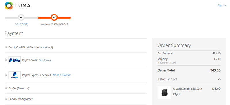
Simple interface
3. Shipping & payment tabs
In Magento 1, information related to shipping & billing was interspersed throughout the six checkout steps. The place where a customer input a billing address was before the shipping information.
It was confusing for customers to figure out which information related to billing or shipping they needed to input. This resulted in payments failing and customers not understanding why.
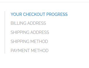
Magento 1 checkout information
In Magento 2, billing address is always related to the payment. When a customer checks a payment method, a space for the billing address shows underneath.
Whereas Magento 1 always required billing address, the Magento 2 checkout doesn’t require billing address for payment methods like PayPal. This eliminates unnecessary steps.
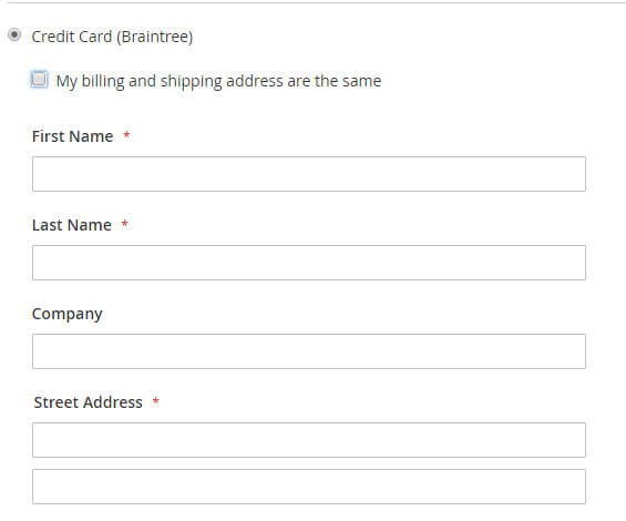
Magento 2-billing address related to payment
The Magento 2 checkout is separated between steps related to shipping and those related to order payment. Customers move from shipping to payment easily. Everything related to each part is in the same tab.
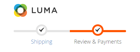
Separate shipping and payment tabs
This separation makes the overall process flow better and eliminates some confusion present with the previous Magento checkout system.
Also, the Magento 2 payment section comes with more payment options like PayPal and Braintree already integrated. This reduces abandoned carts by giving customers the payment options they’re looking for.
4. Automatic guest checkout
When customers enter the Magento 2 checkout page, they are led to a guest checkout page. The first step is to enter an email address. If this email address matches an existing account, shipping and billing information is automatically populated.

Enter email address to start checkout process
This removes the previous interface which presented the choice between checking out as a guest or a returning customer. It also eliminates a step in the process, making checkout quicker.
In Magento 1, tracking an order as a guest was extremely difficult because guests couldn’t log in. In Magento 2, customers who checkout as a guest can create an account on the order success page and have their information saved.
This means customers don’t have to decide whether they want to create an account before they can check out.
Giving guest shoppers the option to create an account allows them to sign back into their account later to see the status of their order. It also encourages customers to be repeat shoppers.
5. Intuitive design
Intuitive design is extremely important when creating a good checkout experience.
What does it mean to be “intuitive?” It means there is a focus on experience and making it easy for customers to complete tasks. It means customers aren’t confused about what they’re supposed to do.
The Magento 2 checkout is definitely more intuitive than Magento 1. Two examples of this are the placement of gift options and discount codes.
In Magento 1, the discount code box is on the shopping cart page, before the customer actually goes to check out. This can confuse customers who are expecting to see the discount code box in the payment section.

Magento 1 discount code location
A discount code box is now located on the checkout page under the section for selecting a payment option. This makes sense because discounts are related to how much the customer pays.
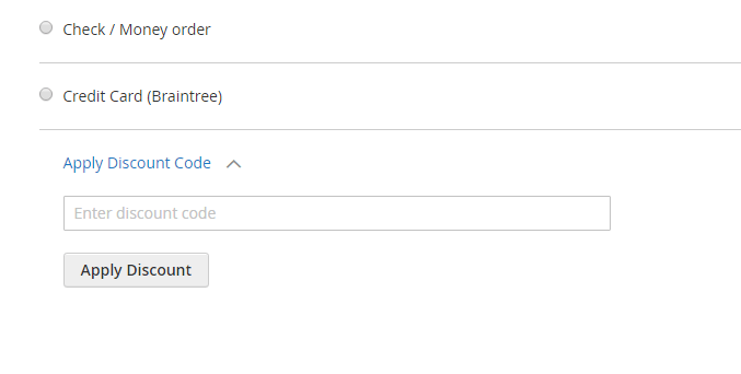
Discount code box with payment options
Another example is gift options. Before, the ability to add a custom gift message was located in the checkout process. In Magento 2, it is located on the shopping cart page, before the checkout process begins.
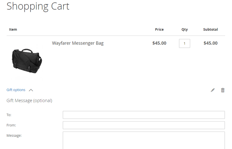
Magento 2 shopping cart gift options
Putting gift options on the cart page makes the checkout process lighter and quicker, so customers can focus on checking out.
Conclusion

While there are a lot of reasons why customers abandon carts, there are some that can be reduced by focusing on creating a better checkout experience.
The new Magento 2 platform does just this. With Magento 2, the checkout process is quicker and less confusing. Customers can easily move from cart to completed order in less time.
Overall, this better checkout experience can help online stores reduce abandoned carts and increase conversions. What’s not to love?


